I intially wanted to feature 2 people in my photos as I liked the idea of a duo. This was all set up to happen but at last minute the plans had changed and it was only possible at the time for one person to feature in the photos. At this point I was willing to give the photos ago just to see if it would work and I knew that I could change my ideas further on. I was happy with the results I got and so I have decided to stick to the idea of only having 1 person. Before taking the photos I decided that I wanted them to be in arange of photos e.g outdoors and indoors. This would require a vareity of different clothing styles as the weather wasnt in good condition. The person I decided to include was a female and I choose her because of the style she is and the sort of person she is. She is very confident and willing to do anything and so I knew that if I featured her in the photos it would come across really well. Before I began to take the pictures I took the opportunity to style her my self. This meant doing her hair make up and choosing the clothes.
I took two pictures one before and after to show what I did.

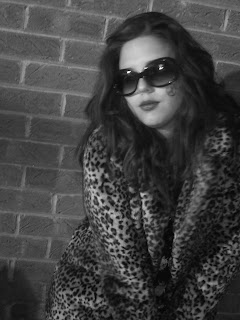
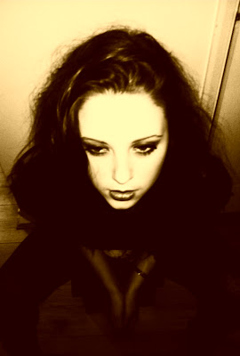
The first shots I decided to take were some outside. I styled the model in a red and white cardigan with an all in one jumpsuit with some military boots as that is quite out there and different but also very wintery which was relevant for the weather. I took some photos in front of a brick wall and a garage as I think these fit in with the type of genre I wanted. I knew that I could edit the photos later to make it look vintage and antique.I also took some inside as I wanted to experiment. I took the photos in a variety of colours. I took some in greyscale, sepia and normal colour. I did this because I knew that the black and white and sepia colours where quite old looking and thats the type of style I am after plus if I got some in colour I knew that I could later edit them to a different colour to make them look better. I also took time to style her in different clothes for a range of choice and so chose to put her in shorts, tights and a top as well as a warm vintage coat and a dress. I took a number of shots with ther all in these different outfits and these are some of the results I got.


I took these photos with a range of different camera shots. I did a close up of her face and I did a medium close up of her sat down. I wanted to see whether I could get any good photos just fom the way the camara was angled. I am happy I chose to do this because I think I have got some ok shots. The one thing I would change is the way I decided to focus the camera. When thinking about were I would place the text on my front cover, there wouldnt be any room as it would cover the models face making it look really unprofessional.
I have narrowed down the photos I am thinking about using and have made a few changes to them.


No comments:
Post a Comment