What audience would be more likely to pick up this magazine?

Friday, 17 December 2010

2 drafts


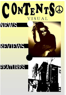
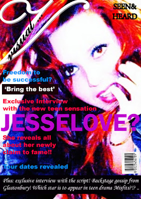
These are two are mock ups that are still in need for a lot of improvement. On my front cover the one main thing I need to change is the mast head. It kind of goes against conventions as the mast head on many other music magazines stand out a lot more and is usually the first thing you can see. My mast head is not so noticeable and doesnt really stand out therefore I will change it to make it more easier to tell the name of the magazine.Also the contents page looks a little bland at the moment and so could do with a few tweeks. Adding colour to it will make it look more like it is from the same magazine as the front cover. There is no consistency at the minute.

Thursday, 16 December 2010

layout for double page spread.

pictures for double page spread.


contents ideas

After experimenting with layout and colour for the contents page I have decided I will only include one picture. This is because I have used more than one on the front cover and so it may look full of photography. I still havent decided on full black and white or colour but I am certain I will use the picture I have used in the drafts. The good think about it is that I change it to have a flash of many colours and so it will work either way.

Wednesday, 15 December 2010

colours & experiments for contents.

From my experiments I really like my contents page with just one picture but all in black and white. However I wanted my contents to be consistent with my front cover and double page spread and so it wouldnt reaaly work. I have thought about having it black and white and just having flashes of blue/red/pink as they are the main colours on my front cover.

Here is one in colour and one in black and white and one with both black and white with a flash of colour.

Tuesday, 14 December 2010

drafts for contents pages.


Pictures for contents page.


drafts


I have done one with pictures and one without and I actually prefer the one without the pictures from wireless festival. It doesnt look too cluttered and it looks tidier. However I think the pictures make it look more like a magazine.My final design will be something similar to either one of these.

Monday, 13 December 2010

drafts for new front cover.

Experimenting with ideas.
I tend to use either one of these.                   Pictures I have taken for my front cover.


These are pictures I took at the wireless festival and so I think they would be good to feature in my magazine. If I had extra pictures on the cover then I would use any of these.

Changes.

As I have decided to change my idea, many things are having to be changed. Some of these things are the colours, pictures and layout. As my previous picture was more retro than the one I have chose to use now, the look will be much different. The picture I am now using is more indie and so that is the style I am going for.
New Themes/Colours
  • Purple
  • Red
  • Blue
  • Pink
  • white
As I want my text to stand out against the photo I am using the best colours to use are bright. My mast head will be in a pink or purple colour as it doesnt really blend with the background and it can be seen. This may come across more feminine and so a male audience may not want to buy this. This maybe favours part of my audience and so I haved decided to just aim it for females.

I will also change the style of mast head as if I stuck to it being across the top of the page then it would interfere with the picture and end up across the models face making it look unprofessional. I have chose to have it as a logo with just a simple 'V' then the word visual wrote across it.

Thursday, 9 December 2010

Front cover changes.

This is my first attempt at the front cover. After experimenting with this picture I have decided to change the main background picture and maybe include another picture at the bottom of the page. I like this picture but I think that it doesnt quite have the look I am after. It looks quite simple and boring and I dont want my cover to look like that. It doesnt really look like a music magazine cover. I also dont like the way the mast head is placed it is too plain.
I am glad that I decided to do this draft as I have found that this hasnt worked for me and I still have time to change it.
I think that some of the pictures I was going to use for my contents page may work better and so I will have different pictures for that. It has now appeared to me that by taking a range of photographs has benefited me as I have the choice to use different pictures.
I like this picture but I was going to use it for my contents page. I have decided against this and so have deiced that I will use this picture on my fornt cover. The two photos I will also use are similar to the one I will use on my contents page. The picture I will use is the stage area at the freedom festival as that is relevent to my magazine. I will use that picture and another similar to it also from the freedom festival to feature at the bottom of my magazine cover.

In order to get the right picture I had to make a few changes. My original photo was ok but lacked any real wowness about it. It was plain and didnt reaaly do anything. As a way of improving it, I  have made a few changes for the better. I have cropped it so that the picture is just of the model and I have changed the contrast. I have also brightened the picture to really capture them deep colours. It looks far more indie now then it did before and so it works perfectly for a front cover.

Thursday, 2 December 2010

Topics to cover in my magazine

Things I could include:
  • Interviews
  • Album reviews
  • Exclusive news
  • Festival launch dates
  • Tour dates
Front cover

Mast Head- going to be placed at the top of the page.
Visual
Main cover line - to introduce the artist on the front maybe a give away for the double page spread.
JesseLo-ve? play on words. JesseLo is her name and she is new to the music industry. Fans treasure artists and claim to 'love' them so I think this would


Main cover line- relating to the double page spread
Exclusive interview with teen sensation
'Jesse' she reveals all about her new 
claim to fame !

Other cover line- something to do with freedom festival or wireless festival
Freedom to be successful!
Back stage gossip from wireless festival!

Sell Line- based at the top of the page.
SEEN&HEARD...

Contents

In my contents page I will include 3 headings that list page numbers and the topics that I will cover in my magazine.

NEWS (main heading)
p.10 - 2012 glastonbury cancelled due to olympics
p.13- Muse confirm tour dates
p.14 Paul McCartney to play at Itunes festival!
p.16- list of artists confirmed for Reading Festival!

REVIEWS (another heading)
p.17 - Wireless Festival
p.18 - Kings of Leon
P.20 - back to the 60s
p.27 - Indies top ten
p.32 - Brandon Flowers in misfits?
p.35 - Retro side of life
p.39 - The killers
p.40- wild and weird

FEATURES (another heading)
p.44 - Jesse Love Interview
p.46 - tickets to Leeds festival
p.47- Interview with The script
p.49 - Behind the scenes with kings of leon
p.50 - Freedom to be successful
p.53 - Win tickets to glastonbury

Double Page spread

My double page spread will be a an interview with the star featured on my front cover. I will include quotes in bold text that I think wil stand out the most to the audience. Here are the two quotes I will use below.
' I'll never fit in, I wasn't made to'
' Im aware of  all the haters they can kiss my a***' 
'

Research and experiments for front cover.

I have decided that I want my magazine to head towards more of the retro genre as I think I could make my pictures more like this. I still want the indie to shine through but maybe not on my front page. As I want sort of a 60s look to it I have researched some photos from the 60s to inspire me.


These pictures were done by Andy Warhol a famous painter. These are the sort of pictures that people would relete the 60s to. I think my pictures mostly reflect this style and if not and can make them like this with a bit of editing therefore I have decided to focus my magazine more on retro. I am not completely changing my ideas as I still want it to be indie, its basically old indie. I have finally decided which photo I
am using for my front cover as I think I can work with it to make it more retro.


The picture was originally taken in sepia mode as I thought it looked very indie. But since I wanted to make it more retro after some thought, I changed the colour to a yellowy/red colour. I thought I liked this at first but then I did some research and I found that blueis a very common colour to include so I did. I adjusted the colour once again and changed the contrast giving me the perfect colour to connote the 60s. I also cropped it to make it more A4 as I knew that I needed to do that since it was a cover. I am now happy with the picture I have and will use this as the main image on the front page of my magazine.
I also decided to change some of the font again mainly the mast head. I wanted to get the type of writing that Shindig magazine uses for their mast head but couldnt find it. The closest I came to was a font called Cooper Black. It looks like bubble writing and so it works perfectly for what I want.


These are two drafts I did including the cooper black font. I have experimented with two different types of layout that I may choose to have. Having the mast head down the left side may look good but it goes against one of the conventions of a music magazine. You usually find that most mast heads are at the top of the magazine either in the corner or stretched across. The other draft with the mast head randomly placed across the top workes better as it follows one of the conventions and it gives more room for the cover lines.This is probably the one I will choose to use but I may decide to change my mind when in the proess of actuallu creating it.

Colour Theme throughout magazine:
  • Black
  • White
  • Red
  • Yellow
  • Green
  • grey
These colours are a mixture of colours that are associated with the 60s as well as indie and rock and roll. I want to make it as retro as possible but also want to keep some of the darkness throughout to cover the aspect of rock and roll. However I think that the rock and roll has sort of come through with the pictures. (smoking and drinking)

Text.


These are some of the font types I have experimented with to have as my magazine name. I really like the type of name that can be made into a logo, sort of like NME. I have decided to change my strap line from' wanting to be seen and heard' to 'seen&heard' its now much shorter and more catchy. It gets more to the point. I like the idea of having just a 'v' to represtn visual, but having just that would take away the actual name of the magazine. My favourite 3 logo/styled names are:


I would like to use one of these three but I like the idea of having something more retro and 60s. But untill I have decided what picture to use, I cant decide what text I would like.

Wednesday, 1 December 2010

Layout of the front cover.

Layout

I have made a few drafts of different layouts for the front cover. These are just rough and so ont really include much information on them.
 

As I havent decided what pictures or text to include I havent noted them down but will at a later date. These are just rough copies of ideas to do with the mast had and the cover lines. I may not choose to use any of these layouts but it shows that I have experimented and thought about it. After I did these rough copies I thought that I should maybe experiment with pictures and the mast head as these can be usually seen as the main focus.